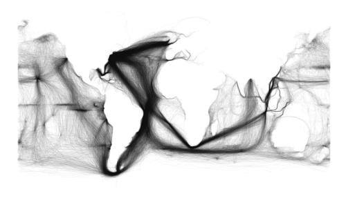
 This amazing graph shows you the populair sailing routes in the 18th and 19th century. The white parts are continents. Isn’t it amazing?
From here: https://19thcentury.files.wordpress.com/2016/08/0f8f4-maurymetadata.png
Advertisements
 Hi! My name is Geerte, I'm a researcher of Nineteenth century history from the Netherlands. This blog is where I write about my favourite subject. Feel free to browse around!
Leave a Reply